
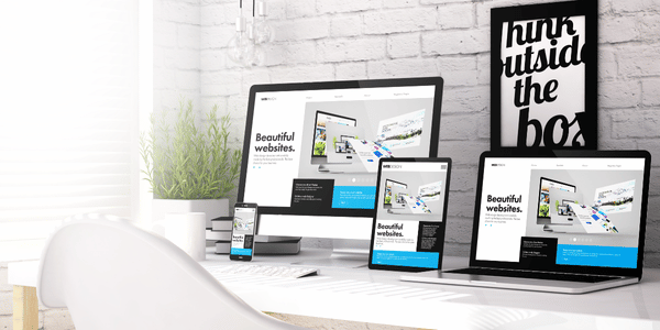
"Website That Speak Your Story"
Problems We Identified
- Users struggled to find key content due to poor structure
- The design lacked credibility and trustworthiness
- It was not optimized for mobile devices
- The client’s team found it frustrating to make updates
Key Issues We Solved
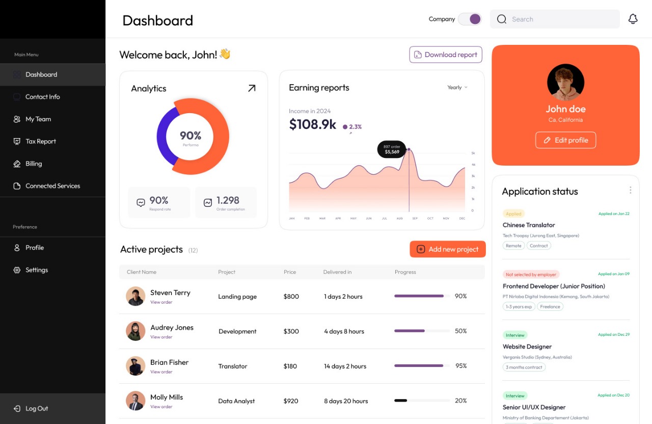
The navigation and layout made it hard for users to find what they needed, causing high bounce rates. We restructured the entire site flow to be intuitive and efficient.
Visual elements and tone varied from page to page. We implemented a consistent design system that clearly communicates who they are and what they do.Visual elements and tone varied from page to page. We implemented a consistent design system that clearly communicates who they are and what they do.
The site did not work well on mobile devices, leading to a poor experience for a large portion of users. We built the site mobile-first to ensure accessibility and speed on all screen sizes.
The previous CMS was restrictive and required technical help for even small edits. We replaced it with a flexible CMS, giving the client full control over content without needing a developer.
The website had large, unoptimized files and legacy code. We improved performance by optimizing images, using modern frameworks, and eliminating unnecessary scripts.
Our Approach
Strategic Layout Planning
Before design began, we worked closely with the client to map out their user goals and business objectives. This ensured that every section of the website served a clear purpose.
Modern, Scalable Design System
We developed a clean, future-proof design with a reusable component system — making it easy to scale as the business grows or adds new services.
Mobile-Responsive Development
Every screen was tested on multiple devices to ensure seamless experiences from smartphones to desktops.
Easy-to-Use CMS Integration
We integrated a lightweight, low-code CMS so the team could update services, change images, and publish blog posts easily — without touching any code.
Conversion-Focused Touchpoints
We added clear calls-to-action (CTAs), contact forms, and sticky navigation to guide users toward booking or contacting, resulting in more leads and inquiries.
SEO & Performance Optimization
The site was built with SEO best practices, compressed assets, and a fast-loading framework to improve visibility and speed.
Implementation Steps
Future Expansion Plans
Content Hub or Blog
For sharing updates, boosting SEO, and positioning the client as a thought leader.
Multi-language Support
To expand into new markets and serve international users.
Integrated Tools
For improving user engagement and simplifying the sales funnel.
Visual Enhancements
Adding subtle animations or micro-interactions to bring the site to life and create delight.

Results : Built to Grow
The new website is clear, responsive, and conversion-driven. It not only reflects the brand’s professionalism but also empowers the team with tools to grow independently.
“We’re now proud of our site. It’s fast, easy to manage, and finally shows the world who we really are.” – Client Feedback